At a recent town hall on Jobs, Betty McCollum made a presentation showing yet another “tricky” chart. This was a creation from the office of Nancy Pelosi that has become a favorite for attempting to portray the Obama administration as having successfully handled jobs and the economy. But does it reflect where we really are for jobs?
http://mccollum.house.gov/images/stories/Statements2010/9-27-11%20slide%202.png

http://data.bls.gov/timeseries/LNS14000000
http://data.bls.gov/cgi-bin/surveymost?ce
http://data.bls.gov/cgi-bin/surveymost
First lets look at reproducing the chart from public data at the Bureau of Labor Statistics(http://www.bls.gov/cps/). The information, and the charts included below (titles added, when obtained from the BLS site it is comes across as a table of data with a crude chart), come from the BLS website, and go back a little further to look at some more historical context in the Clinton and Bush years. This will look at the dot com bubble, the 9/11 strike, and the home mortgage bubble bursts, and the recovery aftermath.
Table 1 includes the spike for the census temporary work hiring in early 2010.

The trickiness involved is that this represents a differential change (first derivative, for those who remember calculus) chart. In addition Betty McCollum’s (Pelosi/Obama) chart is also somewhat smoothed to try to try to make the impact stronger. So to get the correct understanding of what the unemployment situation is we need to do an accumulated sum (integration) of the data. Or we can simply request the real unemployment data from BLS. The chosen statistic was the monthly change in the number of employed persons, so the corresponding chart will be the number of unemployed persons.

This chart 2, above, is unadjusted for population growth and thus has an intrinsic increase built in. Though for relatively short periods you can make reasonable comparisons. So we will switch to looking at the unemployment percentage/rate to normalize for population. The major two peaks that stand out are the Carter and the Obama years.

Looking at the more recent times, we can see that the unemployment rate has leveled off, isn’t getting any worse, as Betty McCollum’s tricky chart shows. But, we still are at historically high levels of unemployment, which her tricky chart belies.

So what does this all mean for trying to assess the current state of recovery?
The analysis at this site http://www.calculatedriskblog.com/2011/07/how-many-jobs-are-needed-over-next-year.html shows that we need to have a job growth rate per month, under different scenarios, of between 224000 to 391,000 to lower the unemployment rate to a still objectionable 8.2% in a year. Unfortunately a far cry from our current levels shown in Betty McCollum’s chart. It is further complicated by the participation rate, those who are still trying to find work or are employed, vs those who have given up looking for now. The methods for reporting unemployment numbers were changed during the Carter administration, and probably tweaked a little in every administration since. So the “real” unemployment is much higher when we include these other “categories” of people who want to be employed, but are discouraged.
ParticipationRate Drops to a Fresh 25 Year Low
1/7/2011 Assuming a reversion to the mean in the long-term average participation rate back to 66%, means that the civilian labor force, which in December came at 153,690, a drop of 260,000 from November, is in reality 157.6 million, a delta of 3.91 million currently unaccounted for.Why The Decline In The Headline Unemployment Rate Is Actually Terrible News
Business Insider Jan 7, 2011,The participation rate has fallen sharply from 66% at the start of the recession to 64.3% in December [2010]. That is almost 4 million workers who are no longer in the labor force and not counted as unemployed in U-3, although most are included as "discouraged workers" or "Marginally Attached to Labor Force" in U-6.
A decline in the unemployment rate mostly due to a decline in the participation rate is not good employment news.
So how does unemployment in this recession compare to others in the modern era (last 64 years)? The following chart tracks unemployment from the last date of the maximum employment, typically cited as the “start” of the recession.
http://cr4re.com/charts/charts.html#category=Employment&chart=EmployPopDec2010.jpg

There are many factors that affect the depth of the unemployment and the length of time to restore employment levels. The one major category that is within our national control are the governmental policies put in place. Are they beneficial to the economy or are they a drag ending up prolonging the period before “full” recovery can occur.
Perhaps Betty McCollum, Nancy Pelosi, and Barack Obama might want to consider this rendition (see footnote) of the data before answering that question.
http://www.politicalmathblog.com/wp-content/uploads/2010/03/CounterGraphMedium1.jpg
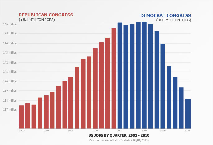
Footnote:
I found the Political Math Blog in the final stage of writing this article. He emphasizes the techniques to create a misleading chart and how he created the somewhat equally misleading chart above as part of his critique of the McCollum/Pelosi/Obama chart. I included it as a “tongue in cheek” addition to emphasize the point that misleading the American people, from either ideological point, does not help to resolve the very real problems that we face. And is a disservice to us all. Both charts are accurate values, just misleading in conclusions.
http://www.politicalmathblog.com/?p=383
Both charts use jobs data taken from the same place, displayed the same way, stripped of context and used to push an ideological point using an implicit "correlation mean causation" line of argumentation.He is well worth the read.
No comments:
Post a Comment